One semi-colon can bring it all crashing down.
Month: March 2014
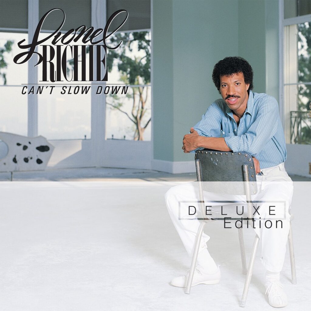
$name = in_array('pears', $fruits) ? 'Fruit Basket' : 'Schmoigal';Can’t Slow Down by Lionel Richie is such a great album.

Cherlene’s New Album

Any fans of the TV series Archer will know that — while the rest of the ex-ISIS agents are figuring out what to do with a literal tonne of cocaine — Cheryl/Carol has renamed herself to Cherlene and is on her way to becoming the star of outlaw country music.
Archer is one of my favourite shows on TV at the moment. As well as this I have been getting into listening to more country music thanks to this post by Andrew Clarke. So imagine my surprise when I found out that a full album of both original and cover songs sung by Cherlene herself had been recently released for digital purchase. Woooohoooo!
But this isn’t just a novelty TV series album filled with parody songs. This is actually a genuinely good country album. The songs are actually sang by country artist Jessy Lynn Martens, who is also classically trained on violin, mandolin and guitar.
The album also features a duet with none other than Kenny Loggins on a country version of Danger Zone — yes, it’s that good.
Cherlene Track Listing
- Danger Zone feat. Kenny Loggins
- Swing Shift
- Midnight Blues
- 40 Miles of Mountain Road
- Baby Please Don’t Go
- Cherlene’s Broken Hearts and Auto Parts
- I’ll Burn It Down
- It’s All About Me
- Eastbound and Down
- Chattahoochee Coochie Man
- Gypsy Woman
- Straight To Hell
If you only listen to one song from this album, listen to Danger Zone. But I promise if you do, you’ll probably end up listening to the whole album.
Even ducks love pom bears.
The Dvorak Keyboard

When I took a trip to Paris a few years back, I had to pop into an internet cafe to find the location of a place I was after. Because – it seemed – I was hopelessly ill-prepared.
So I paid my money to the nice man in the corner; sat down; quickly typed my search and hit enter, only to find I had been presented with an empty results page. It seems Google didn’t recognise ‘me wenith’ as a Parisian Live Music Venue. This is how I was introduced to the French keyboard layout.
In telling this story today to a friend, he introduced me to another layout that I had never heard of – The Dvorak Keyboard (also know as the Simplified Keyboard).
The Dvorak Keyboard was originally patented by Dr. August Dvorak and his brother-in-law, Dr. William Dealey. It was developed to be an improvement over the well-adopted ‘qwerty’ layout that we still use today. The design of the Dvorak layout was based on much research into how people typed as well as percentages of the time spent typing in varying areas of the keyboard. It was stated that the Dvorak Layout would make it easier to type common words with the minimal of movement and finger strain.
Despite the research and slight adoption of this layout, it never really made it into popular use and so the ‘qwerty’ layout is still the primary keyboard used on western computers / devices to this day.
Jumping the Shark
The term jumping the shark, I discovered today, is an idiom that is a way of describing when a television show’s quality begins to decline. It originated from the television show Happy Days in its season five premiere, where The Fonz literally jumped over a contained shark on a beach front.
This was quite a step away from its usual family and adolescent related story lines set against the nostalgia of the 1950s.

The usage of “jump the shark” has subsequently broadened beyond television, indicating the moment when a brand, design, or creative effort’s evolution declines.
Wikipedia, Jumping the shark
Cabin Pressure is brilliant. Listened to first 2 on way home.
If you watch 4 episodes of #24 each day from tomorrow till day before premiere of #24liveanotherday you can catch up on all. #jackisback
WYSIWYGs will kill us all
So okay, maybe they wont literally kill us all, but you’ve got to admit — they can be pretty damn annoying. At least with ones I have used.
I’m not dissing wysiwygs — just what they get used for.
Firstly let me just say that I use a wysiwyg editor on my own blog and it does exactly what I need it to. I type text and it saves that text. I click to add a link and it adds a link. Brill!
For a blog, where writing long posts with the odd link and / or bolding of text, a wysiwyg really is great. But what I don’t believe in is using a wysiwyg for anything more than that.
Let me explain.
With a standard WordPress install, when you write a post or page, the content from the wysiwyg is spat out by the function the_content(). This displays all that content in one block within the page. Of course WordPress is — at its roots, a blogging platform (and a damn good one) so the ease of writing and publishing has always been at the forefront.
But what if our content is more than just a blog post? What if it’s an album or film review? Or specifications for a car? If we bundle all of the content into one block then we are a stepping away from what we need most nowadays, which is structured content.
The need for Structured Data
The need for structured data these days is more important then ever. With the whole multi device landscape, a site’s content needs to be able to display beautifully whereever it is viewed. We need to be able to control as much of the content in as much of a modular way as possible. Also, as a result of making content more modular, it means it can be a lot easier to group and sort that content.
For example, if we have a database of 500 albums with all of the content for each album in its own single block of content, it makes it extremely difficult to categorize those into various artists or genres. Whereas if it was set it up in a way that has separate fields for each content chunk — an artist field; a genre field; etc — then those albums could be easily sorted and categorized.
Karen McGrane gave a fantastic talk at An Event Apart, Boston in 2012, where she talked about the TV Guide who made a wise decision about their content structure back in the 1980s. She talked about how the TV Guide wrote out three different descriptions of the same programmes — One small, one medium and one long. This was before TV on demand or Tivo, where now that sort of structured content is invaluable for use across different devices and contexts.
I recommend you watch the video, but I wanted to include a great quote from that talk here:
…a clean base of presentation–independent, well–structured content that you have designed, from the start, with the intent that you may want it to go out and live on a wide variety of different platforms. In fact you know from the beginning this content is going to have to live in a variety of different places…
Karen McGrane An Event Apart, Boston, 2012
Example – content for a music album
All the content for an album in one chunk:
<-- Output Html of the_content() in a wordpress site -->
<p>This Train features 12 songs from the angelic, sometimes haunting, voice of Chrysta Bell. It was produced by David Lynch and features songs written by them both, including the track 'Polish Poem' from the film 'Inland Empire'.</p>
<p>Artist: Chrysta Bell</p>
<p>Produced by : David Lynch</p>
<p>Release Date: September 29, 2011</p>
<p>Tracklisting:</p>
<ol>
<li>This Train</li>
<li>Right Down To You</li>
<li>I Die</li>
<li>Swing With Me</li>
<li>Angel Star</li>
<li>Friday Night Fly</li>
<li>Down By Babylon</li>
<li>Real Love</li>
<li>Bird of Flames</li>
<li>Polish Poem</li>
<li>The Truth Is</li>
<li>All the Things</li>
</ol>
So while the above html code is okay, it doesn’t allow for much flexibility.
What happens if — in a few years — the website gets a complete redesign? Imagine there are 500 albums in the site’s database. Well then we’ve got a problem. We can have a lovely new shiny design but the bulk of the content is already set in stone somewhat.
In the example above we have the track listing below the review. What if we wanted to flip that? Or better yet, what if the new design wanted the track listing removed? What do we do then? Use regular expressions on the html to remove the track listing from the content?
No.
Also, as mentioned in Karen McGrane’s talk, the content should be able to live in a variety of different places. What happens if the content is viewed through a smart watch, or internet fridge? Will we want all of that content handed to us in one chunk?
Probably not.
Maybe we want to display just the Album title and artist with the option of loading in the track listing if needed.
In the music album example above, we can see sensible chunks of content that could be easily separated into sensible content chunks:
- Track Listing
- Review / Description (perhaps differing versions for use in different contexts?)
- Producer
- Artist
- Title
- Release Date
Using separate input fields for each of these chunks, means that each part of the content is individually available and much more flexible in how and where this content can be displayed.
WordPress has custom fields that can be entered on a per page/post basis, as well as the ability to add custom post types. No doubt other CMSs have similar options available — I’m just not very clued up on those ones.
The use of these custom fields is definitely a step in the right direction, but what we need is for CMSs to be more content-modular at their core. Like I said before, I’m not clued up on CMSs — other than WordPress and OpenCart — so please don’t hunt me down and shoot me in the face if there are indeed CMSs out there already like this.
And if there are please let me know of some good ones.
Tar!
Inspiring this post
This post was originally going to be me snivel–bitching about wysiwygs. But I heard this podcast on the web ahead, which talks about content structure in great depth and it got me thinking about it in more detail than my initial post. The podcast also mentioned that talk by Karen McGrane.
On the evening of me writing this post, before publishing the following day, I travelled down to Milton Keynes Geek Night and saw five fantastic talks.
One of those talks was by Relly Annett-Baker called ‘Future Perfect Tense: creating good content for an imperfect web’. A lot of what Relly was talking about was stuff I had been thinking about that day — so that was nice.
I will link the recording of the talk when it goes online as it is well worth a listen.
Farcry 3 is absolutely stunning.
Off for a cuppa tea and to kill some pirates. Peace! #farcry3
